
Overview: Designing a Chess Set
Designing a Chess Set has been one of my goals for a long time. I’ve tried a bunch of different design variations to finally come to a very classical looking chess set. While designing a chess set isn’t directly rooted in engineering, it really requires a lot of design work. Most pieces are easily rotated after they’ve been designed, but the knight is quite unique.
Each piece has to be within a certain scale of the others, and if they aren’t, it looks strange. If you’ve ever played chess with very unique pieces, you know that after 10 turns it gets a little difficult to determine which piece is which. This same thing can happen with pieces that are not scaled properly. A pawn can easily look like a bishop from the top-down view.
Fortunately, there are some guidelines provided by FIDE on regulation chess pieces.

The heights were useful in determining scale, but the bases should really be the same size to create a cohesive look and feel.
Iteration 1
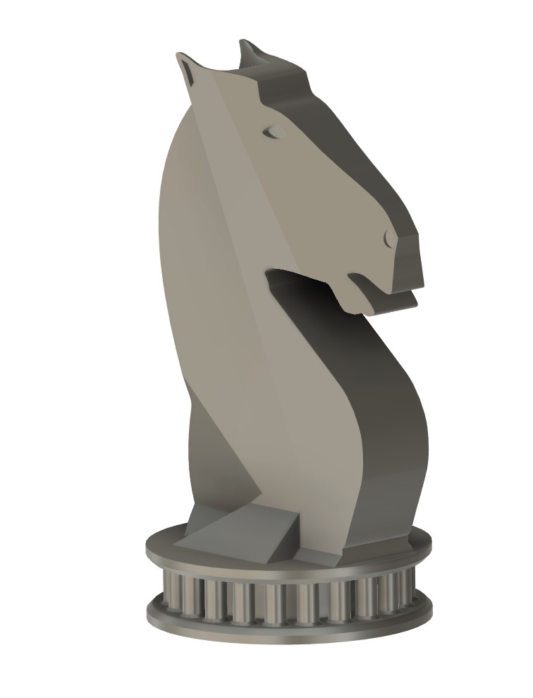
The earliest version of the pieces referenced Doric greek architecture - pillars surrounded the base and flat lines gave a very chiseled look to the pieces. This was great in concept, but the issue was weighting. Metal 3D printing has limitations, and overhangs like the horses jaw were not going to work well. The support structure would be resting on a steep incline, and as the part sintered the support structure would fall out leaving a broken jaw. Unfortunately, this wouldnt be the best solution.
Iteration 2
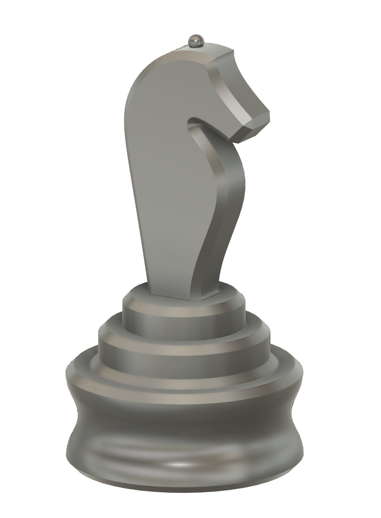
The second version of the knight tried to dial back the complexity of the part. As each piece gets more complex it needs to fit in style to the other pieces, so a complex version of the knight meant a more complex version of the pawn, king, queen, bishop and rook. Unfortunately the design was way too simple as it didn’t display my ability to design in any way and it really didn’t make for a compelling chess set.
Iteration 3
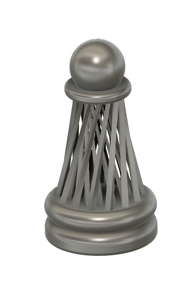
I started to revamp my strategy - I knew I could design the knight, but the commonality between each piece was the base. A solid, good-looking base could then be adjusted to each piece, and because I was using metal 3D printing, I could create designs that would otherwise never be created. This base concept referenced Voroni structures, while still being printable. Two layers of trapezoidal pillars were created and then rotated to different degrees to create a base structure that displayed a parallax when rotated. This was great in concept but extremely difficult to print.
Iteration 4
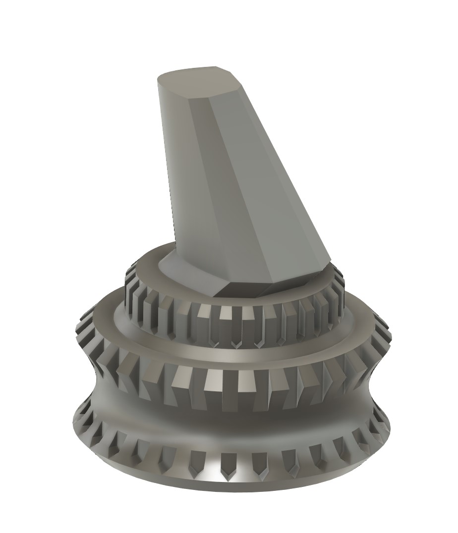
I reviewed my previous work and returned to a more classical thematic look. Medieval walls were the theme that influenced this design. The jagged edges and rigid structure could make for strong pieces, but in the end, the weight and overbearing amount of base took away from the identity of the piece. I was getting closer.
Iteration 5
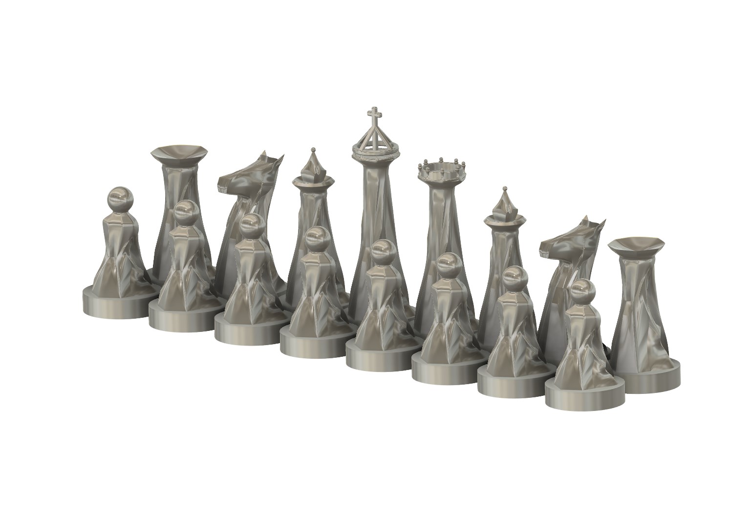
This set was simple and elegant, which started to become my ideal theme. The identity of these pieces was draped cloth, with sharp corners and unique identifiers that created a beautiful chess set. The base of the part became unobtrusive and just created a plate for each piece to display its own beauty. I really was proud of this one, and we printed the pieces. Unfortunately, it was plagued again. The knights jaw was too far forward and broke in sintering, the rim of the rook was too sharp, the ball on the bishops hat was too small, and the kings crown was too intricate to make it through the process. If I was working with SLS or DLM 3D printing these pieces would have been beautiful.
Final Version

This was the last set - designed so that each piece fit functionally in the players hand. A creation that identified with classical chess pieces and fit to scale perfectly with one another. Each piece has a Yin-yang etched into the base and is designed such that the thumb and forefinger have clear placement points on each piece. These pieces were printed on the Desktop Metal Shop system, media blasted, polished and sent off for coating.
King
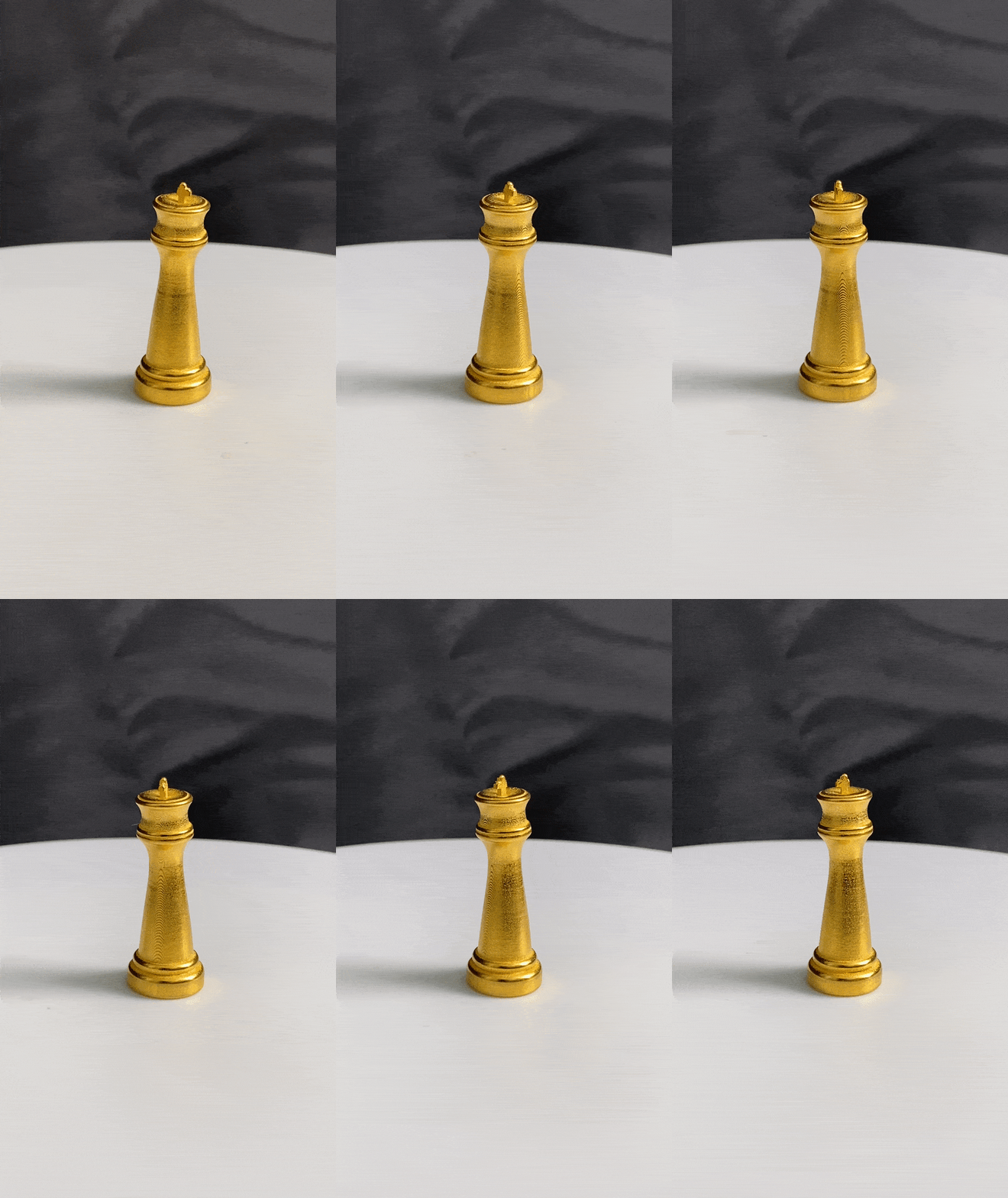
The king is a simple piece. The thumb and forefinger rests just below his hat. His hat brim has a slight puff on the edges before contouring downwards to the center where the cross spouts out. The puffed hat creats the clothy appearance that a traditional royal crown would make. The piece has a harsher arc from base to top, creating a more masculine look.
Queen
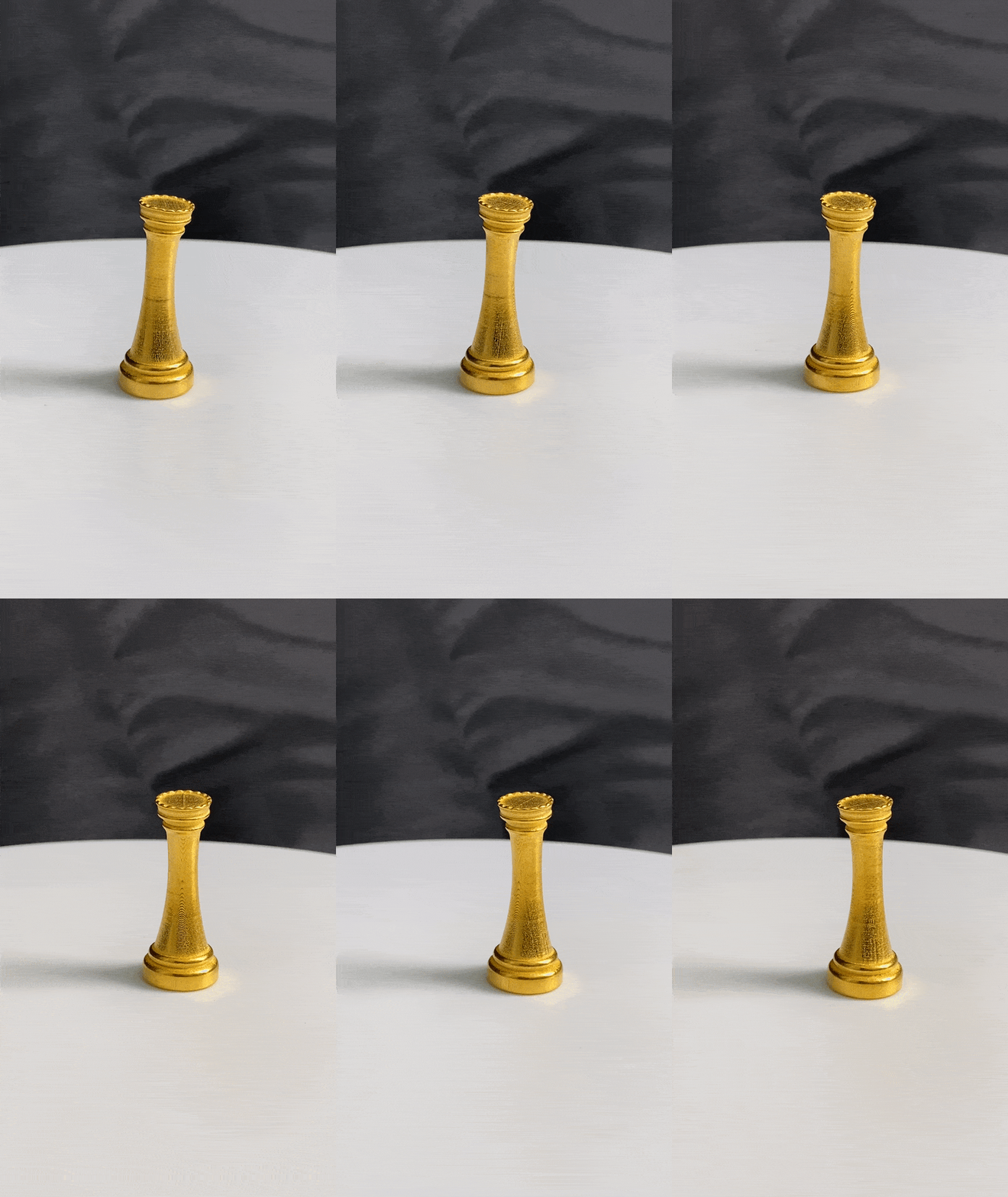
The queen is another simple piece. Again, the thumb and forefinger rests just below her hat. The piece has a more central arc to create a more hourglass shape and the crown has small edges to catch light and create a textured feel - flat in the center to display that it really is a crown.
Bishop
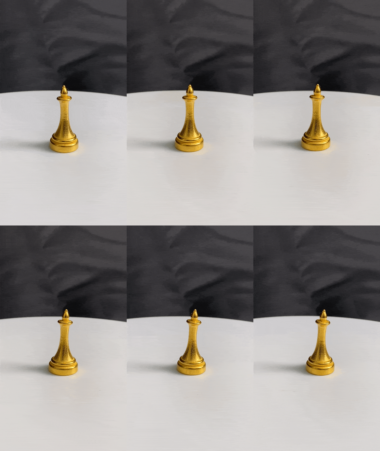
The bishop has a wide base, quickly narrowed to the neck and flared out to create a holding point. The helmet has no face so that the piece is always facing the correct direction (or always the incorrect one?) and the helmet has a small ball on top to catch light.
Knight
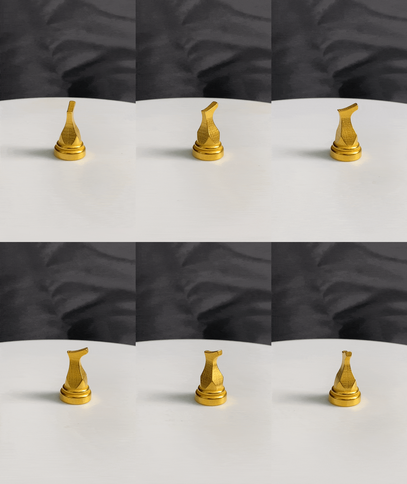
The knight is a difficult piece to design, but this simplistic version addresses the past issues of the mouth being too far over the body. It faces up boldly and has contours that quickly move from the base up to the neck. This creates two distinct ways to hold the piece - under the jaw, and at it’s back and on the sides. It is simple and clearly displays the piece for what it is.
Rook
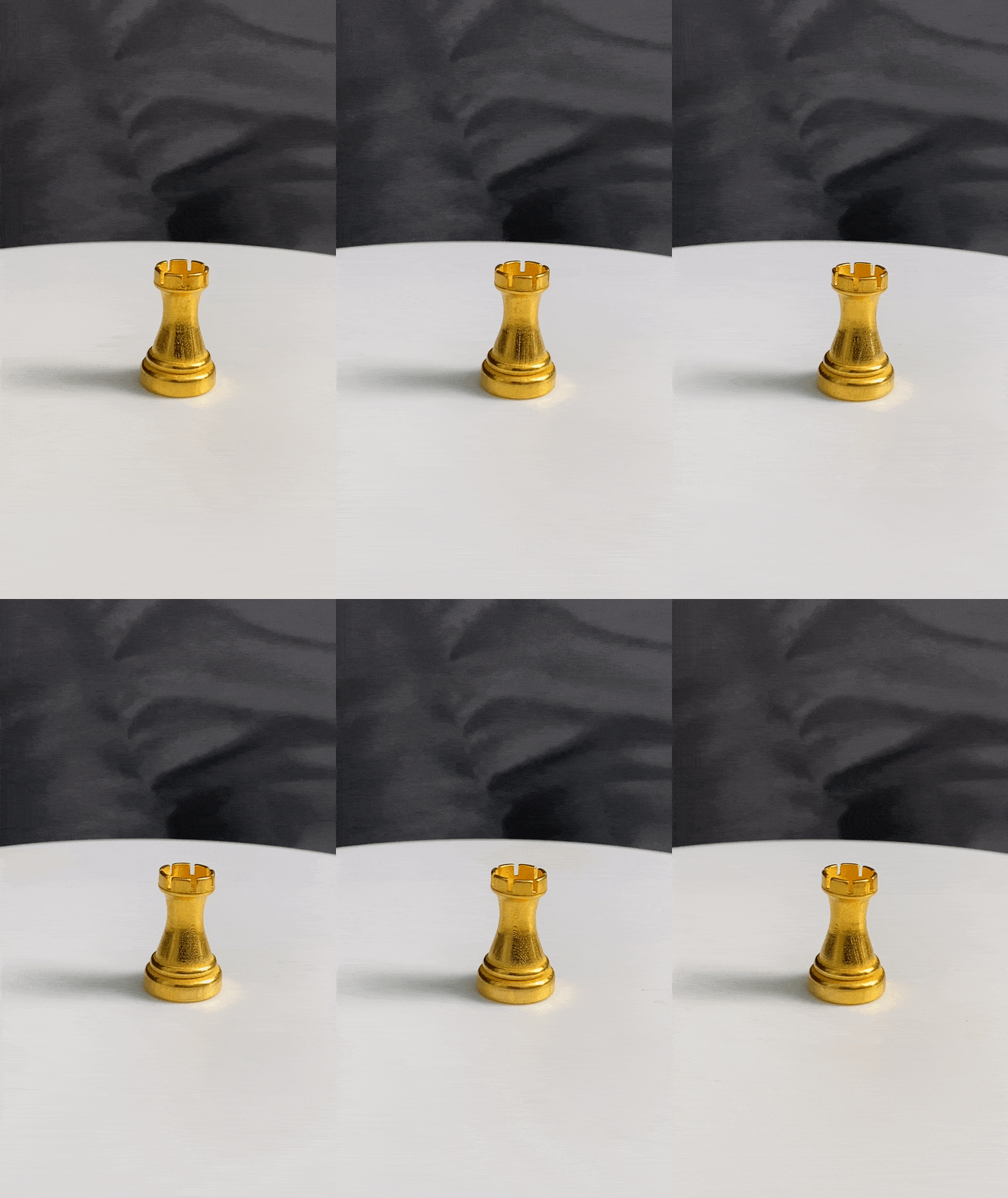
The rook is designed as a castle pillar, thick in its body with slight curvature to identify where your fingers should go. 6 slits in the top create the classical look that identifies the rook.
Pawn
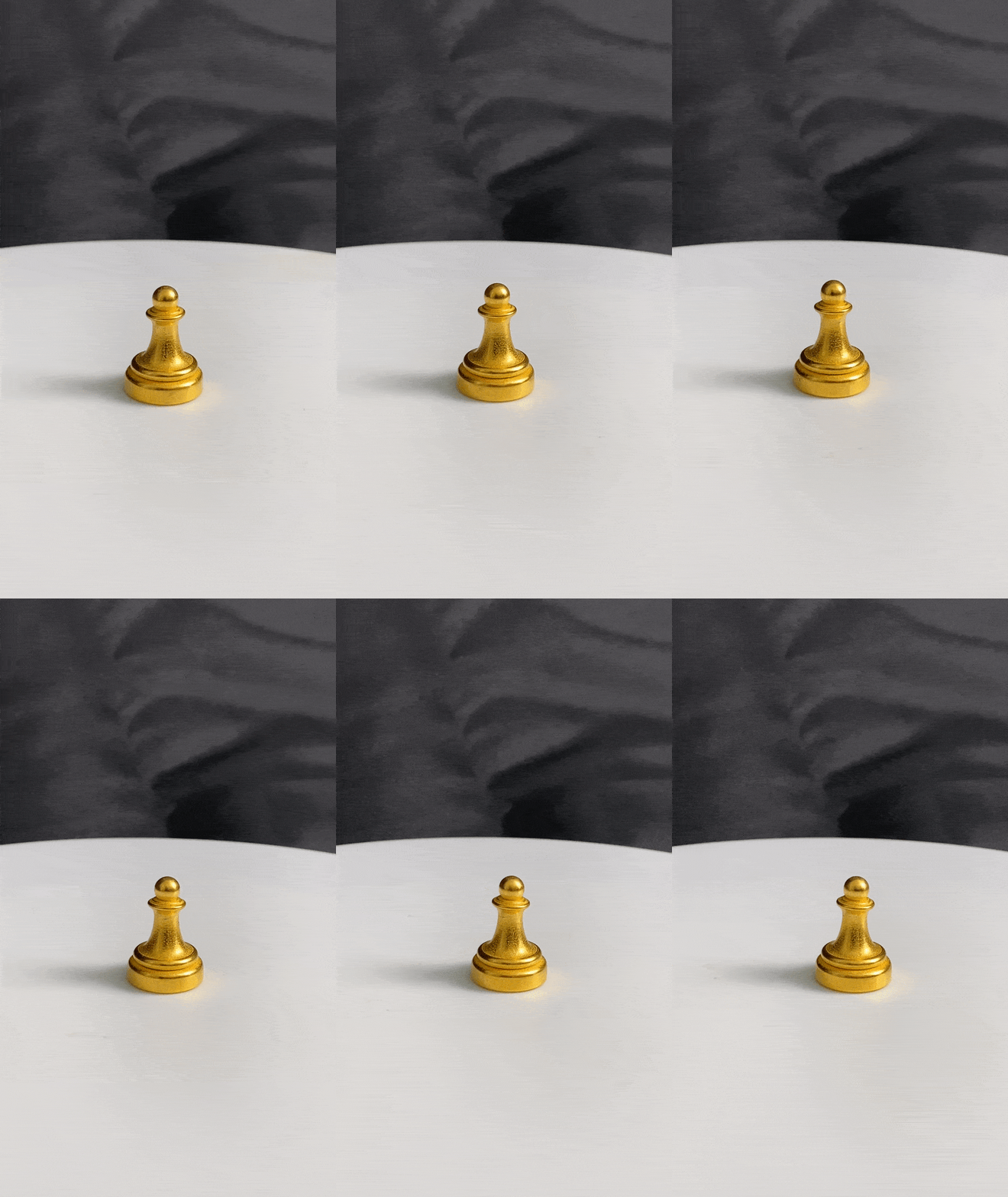
The pawn simple and small. It has a narrow base that narrows further to the neck, creating a holding point. The single ball on top of the neck shows the head of the piece and creates a reflective surface that contours well with the base.
Final Thoughts
This project was amazingly productive in terms of design. Functionally, each piece has hold points while also conforming to the specifics you’d expect from each chess piece. Each piece follows its nature while being unique to the design that I intended.